Creating killer websites is way easier since Elementor stepped onto the scene. But Elementor's always improving, meaning we've got new decisions to make.
Recently, they’ve released a new widget called Container which is supposed to replace sections and columns. And if you’ve been using Elementor page builder for a long time, you might worry if this new feature will make your layout skills obsolete.
Should you stick to regular sections or try these new flexible containers?
Both have their pros and cons when building pages. Sections feel familiar, containers promise advanced flow. But how exactly are they different, and could replacing sections with containers require big rebuilds?
This Elementor container vs section article breaks it all down for you. We'll explore why containers might win for some designers but mean overcomplication for others. Most importantly, you'll finish knowing whether making a huge switch to containers is worth it.
Elementor Container vs Section Differences
Before jumping in, here’s a quick overview of Elementor containers and sections:
| Feature | Sections | Containers |
| Layout structure | Uses a traditional approach for organizing content | Offers advanced options for creating dynamic layouts |
| Customization | Offers preset styles that can be adjusted for various needs | Provides greater flexibility in design customization |
| Responsiveness | Responsive, with basic settings to adjust the layout for different devices | Better responsiveness control for different screen sizes |
| Code structure | Tends to generate more code which can affect the performance | Produces cleaner, more efficient code, which enhances loading speed |
| Interactivity | Requires plugin or custom JavaScript code | Enables entire containers to be clickable |
| Best for | Basic layouts | Both basic and complex layouts |
What Are Elementor Containers?
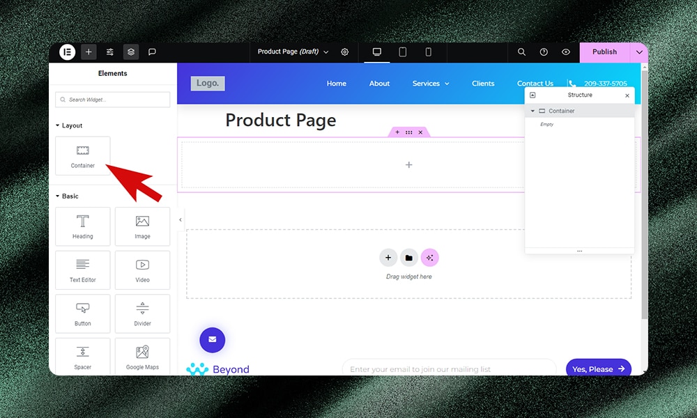
Containers in Elementor offer a new way to organize website layout and content. They’re like boxes that contain the different elements of your webpage, such as text, images, and buttons. But unlike using sections and columns, containers offer more freedom for complex designs.
Sections and columns have an obvious pain point - a lack of flexibility. It's difficult to achieve nesting if you want to add intricate details. Containers solve this by allowing flexible nesting for complex layouts.
The traditional section approach also produces heavier, more cluttered code that can slow page loads. Containers, on the other hand, reduce unnecessary dividers and improve site performance through streamlined code.
Grid Containers vs Flexbox Containers
Elementor has two container options - Grid and Flexbox.
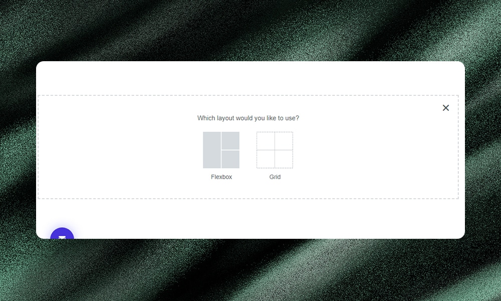
Flexbox containers are best for simple, one-direction layouts. They make responsive design easy by aligning elements vertically or horizontally. Flexbox is very intuitive for beginners to pick up.
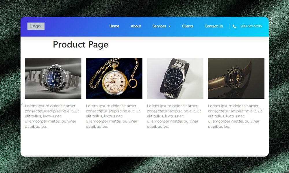
Grid containers are more powerful for complex, multi-directional layouts. They allow precise alignment in both rows and columns for symmetrical or grid-based designs. However, grids have a steeper learning curve.
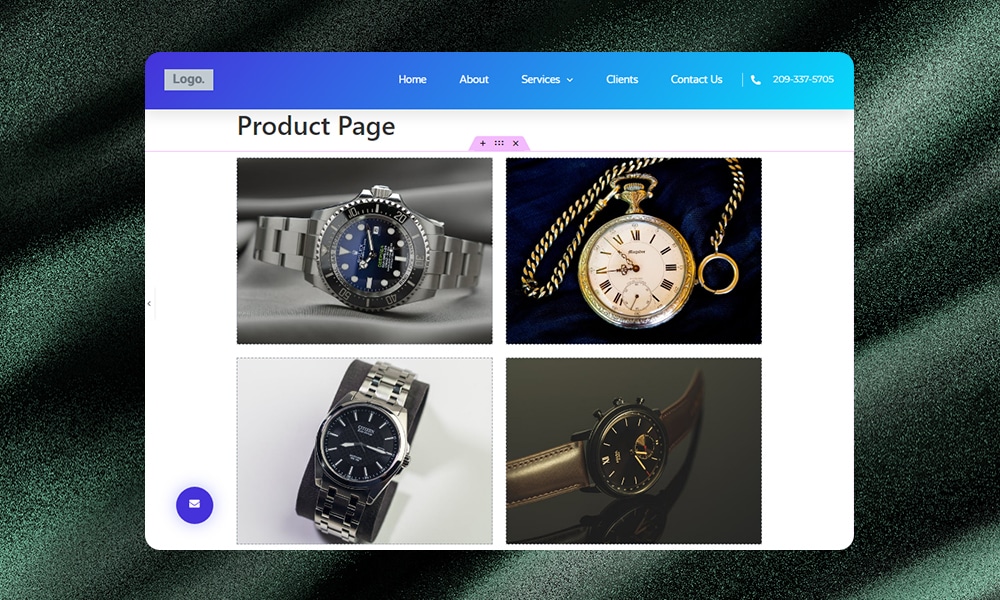
If you’re just starting out with Elementor, then you might want to try designing with Flexbox first. But if you like creating more complex layouts without compromising the performance, then you should use Grid.
Why Use Elementor Containers Over Sections
Elementor initially introduced containers to test out more flexible page-building options beyond regular sections. After receiving positive feedback from users, it has now become a stable feature.
But how exactly do these layout boxes liberate creativity and enhance workflows? Here are some of the key benefits we’ve observed:
1) Easier to Create Complex Layouts
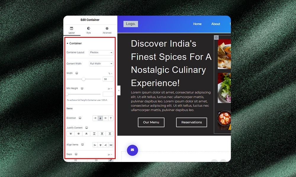
Containers push the boundaries of your web designs far beyond the constraints of standard sections. You can tweak, adjust, or rearrange elements easily. You can position or align elements with precision in contrast to using sections where you’re often limited to a predetermined set of rows and columns.
2) Supports Deep Nesting
Sections and columns can make layering difficult and messy. Containers can address this pain point by allowing deep nesting. This means you can create sophisticated multi-layered designs without issues.
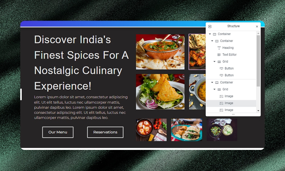
For example, you might want to build product pages with lots of details included. Instead of adding layers and layers of sections, you can just use containers to organize and structure your content efficiently. You can create a container for each product feature, description, image gallery, or customer review section, and then nest these containers without overwhelming the layout.
3) Improves Web Page Performance
When you use traditional sections and columns in Elementor, each element requires additional HTML wrappers. These wrappers can increase the complexity and size of your webpage, which can slow down the loading time.
Containers, on the other hand, reduce the need for these extra wrappers. With a more streamlined code, your web pages can load faster because there's less for the browser to process. Faster loading times mean better user experience, which increases engagement and decreases bounce rates.
4) Flexibility in Responsive Design
Elementor Containers make responsive design much easier than using sections. With containers, you can fluidly move elements around and adjust layouts for any device.

You get better control over spacing and alignments. To be honest, we find this more efficient than reconfiguring multiple sections per device.
For example, instead of adding multiple sections, you can simply use a single large container to handle the same layout.

Another issue with sections is that you’ll need intersections to split columns across. Again, this can cause limitations for responsive design. Containers avoid these issues by automatically optimizing row layouts for different screen sizes.
5) Reuse Elements Across Pages
Sometimes, you might want to reuse certain elements to reinforce brand identity, provide a consistent user experience, and save precious time. Thankfully, this can be easily achieved with containers.
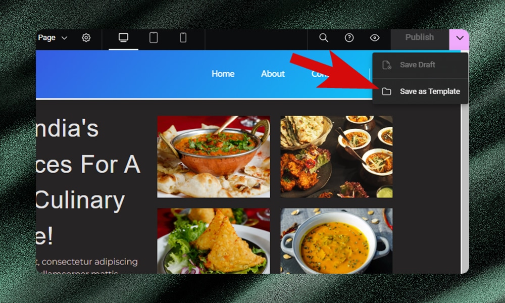
Let’s say you have a section with a specific button style and color scheme that you want to reuse on a different page. With containers, you can simply add any elements you want and save them as templates. You don't have to rebuild everything from scratch.
6) Making Entire Containers Clickable
If you're using sections and want to make them clickable, things can get a bit tricky. Typically, you might have to use plugins or write some custom JavaScript codes to get this job done. But there's a simpler way when you're working with containers.
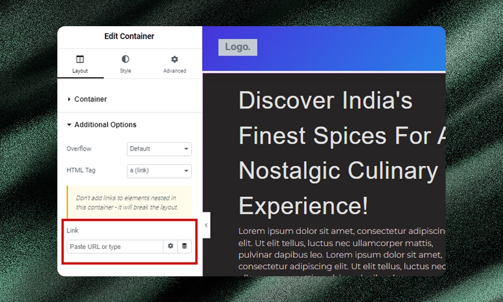
From the left side menu, go to Additional Options and, under HTML Tag, choose a (link). Then, put in the link where you want people to go when they click on the container. It’s that simple.
Should You Convert Sections to Containers?
If you need to add intricate layouts to your website, containers are obviously a better choice.
But should you convert your existing section-based site to use containers instead? Well, it depends on your goals and preferences. You’ll also need to consider several key factors, such as time, effort, and resources when deciding to make the switch.
First, check if containers are compatible with your site's current setup. If you're using specific plugins or themes that work well with sections, make sure they also play nice with containers. If not, you could run into problems that mess up your site’s functionality or appearance.
When making a switch, be sure to test your new container layout on a staging site. Doing so will help you catch and fix any problems before going live.
Next, review how your content is organized and plan the conversion carefully. Moving to containers could end up in two things - you either improve or complicate your site's structure, depending on how it's currently set up. Just like reorganizing a closet, your goal should be to enhance accessibility and appearance, not the other way around.
Lastly, think about your own ease of use. Are you comfortable with sections? Then learning containers might take a bit of time. The great thing is, that once you learn how to use containers, you'll find they make your work easier. So if you don’t mind the slight learning curve, then the switch is definitely worth a try.
Elementor Container vs Section - FAQs
What is a container in Elementor?
In Elementor, a container is a layout element that lets you organize and style your webpage content more dynamically.
What is the difference between a container and a section?
Sections are Elementor's original building blocks for basic web page layouts. Containers are the newer alternative with more flexible nesting for complex designs.
How do you use sections in Elementor?
In Elementor, you use sections by dragging and dropping the section element onto your page. Then, you can add various widgets inside to build your layout and customize the padding, color, size, and more to achieve your desired look.
How do I convert a section to a container in Elementor?
To convert a section to a container, simply hover over the section and click the Edit Section icon. From the Edit menu, select Layout and then Convert. Make sure to convert sections one by one so that you can easily make the necessary adjustments.
Wrapping It Up
Containers promise more versatility and responsiveness versus rigid sections. Moreover, for most developers and businesses, time is money. Containers tend to be a better and more practical option because they’re faster and easier to use.
However, adjusting to containers takes time if you’re used to old-school sections. Before making a major switch, test your new container layouts on a sandbox site. Experiment and see how they perform before going live.
